
Design Challenge
Pink Stork, a pre and post natal supplement brand, only targets women, but looks to expand their brand to include children’s supplements. Their packaging is designed to provide a warm appeal to purchase supplement products. While their current branding system appeals to women who are pre and post natal, Pink Stork’s system does not currently appeal to the supplement needs of their children.
Solution
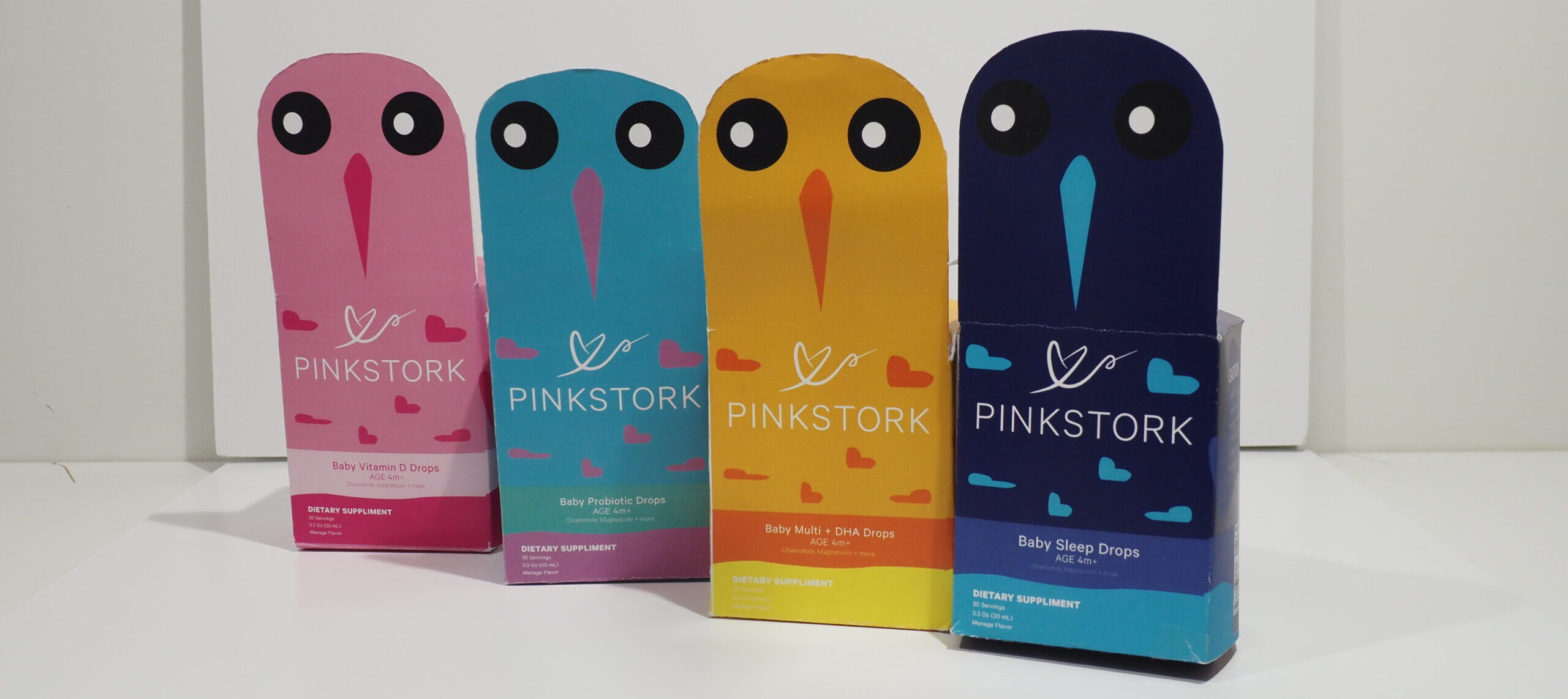
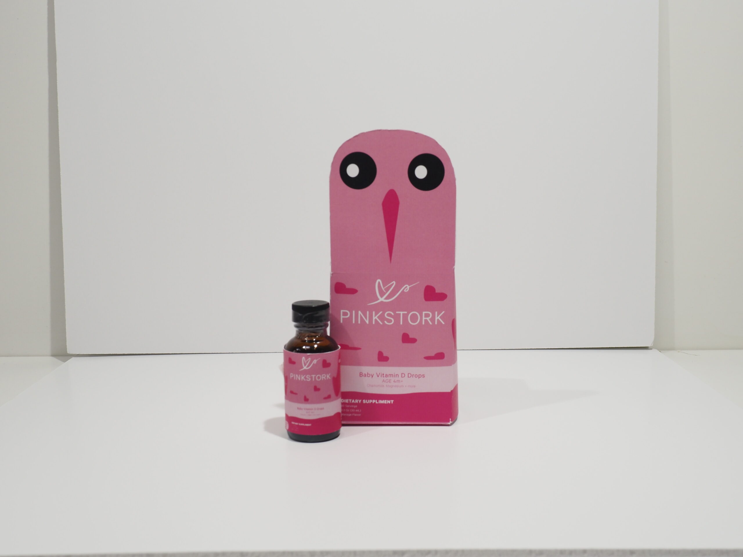
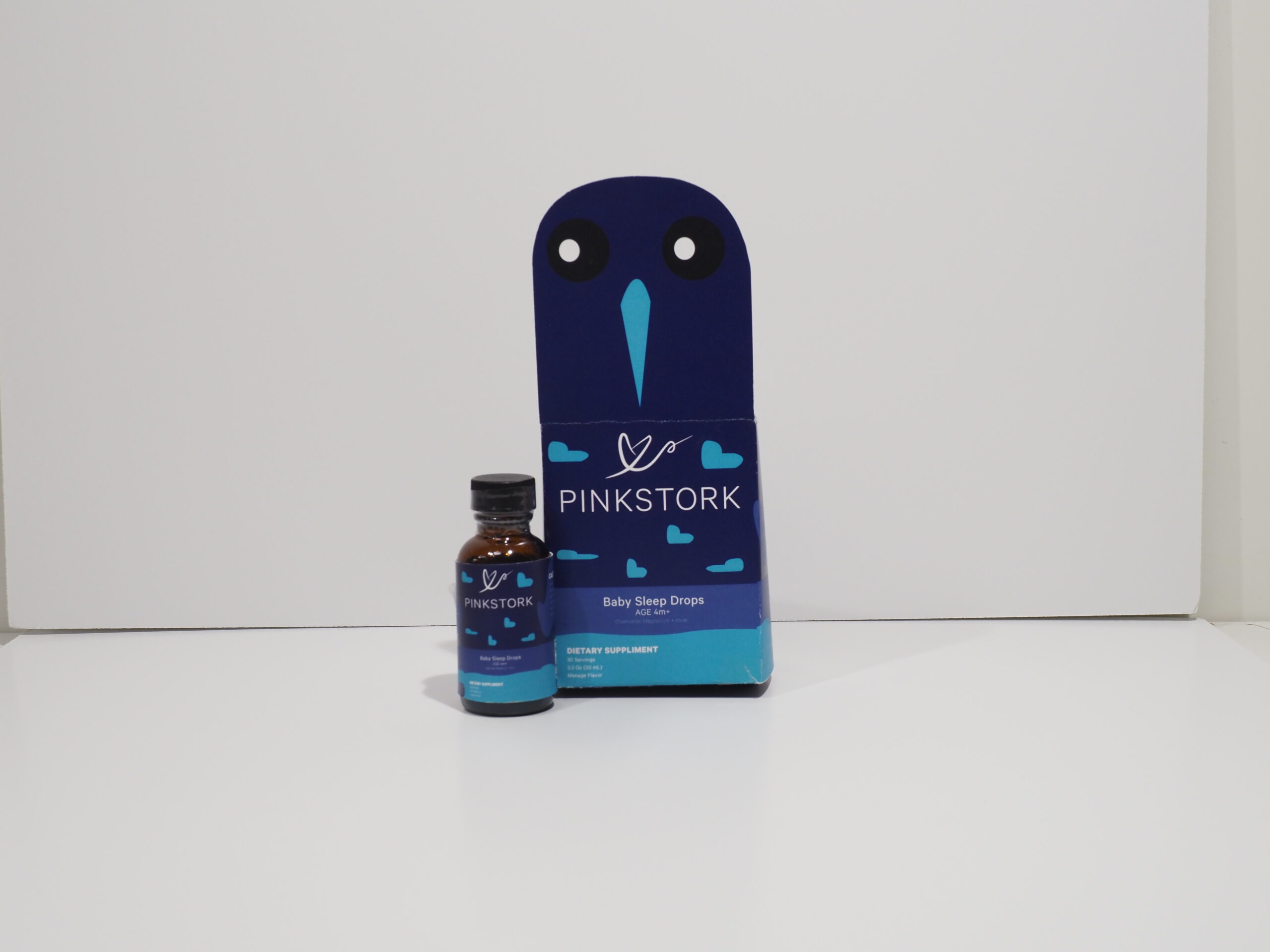
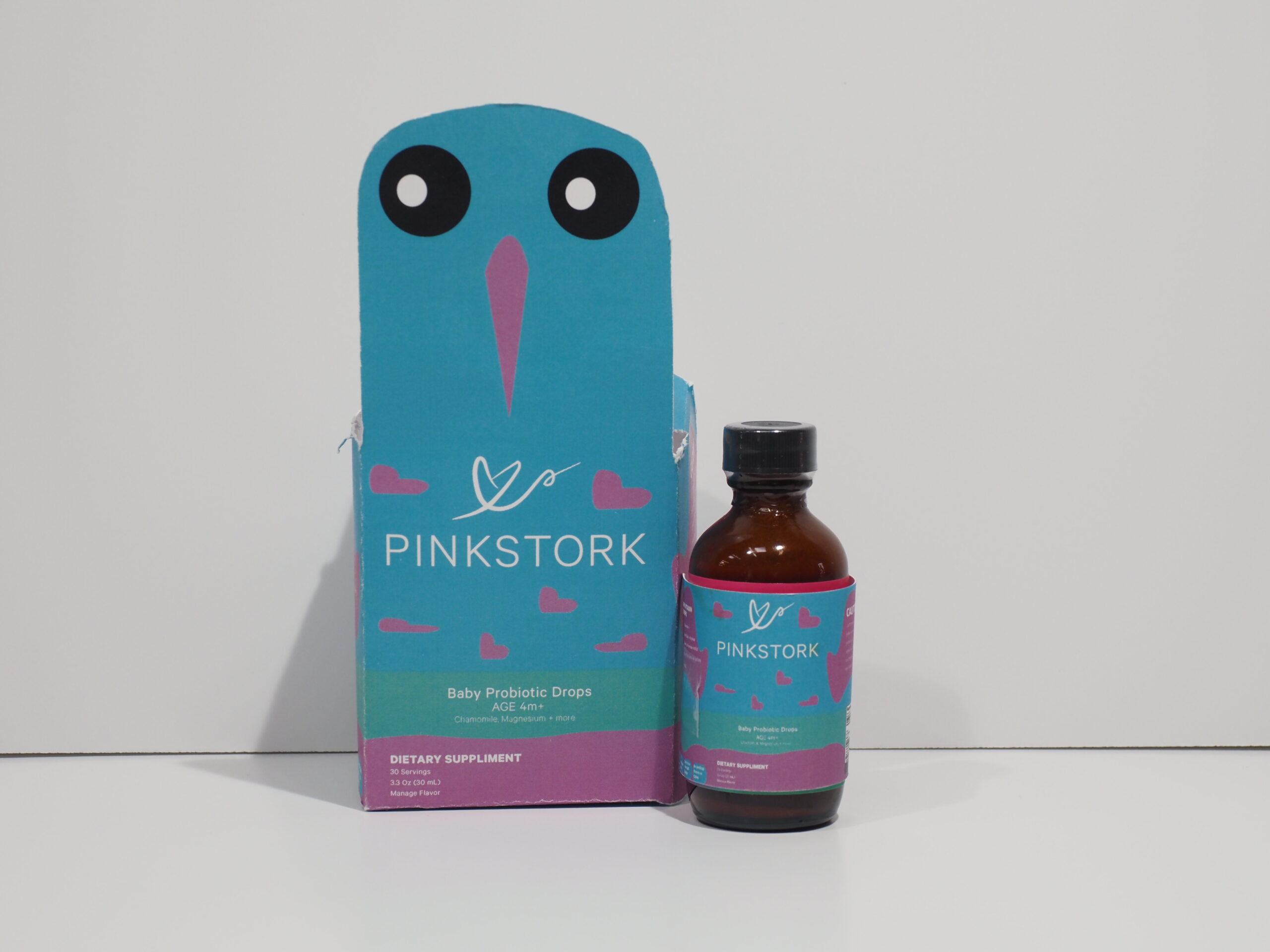
By completing competitor research and sketches, four re-branded packages were developed. The solution was a baby stork to appeal to elicit an image of children. Each package was created in various colors to match the meaning of each supplement product. Using Adobe Illustrator and Photoshop, each were traced with vector art, furnished with brand guidelines, and printed into a physical package.
Project Outcome
The outcome for Pink Stork will result in more women choosing the brand for their children. The concept of the re-designed package will elicit an emotion about children due to the baby stork imagery. The cute aesthetic from the stork will convince parents to buy that the supplement is beneficial to a healthy child.


